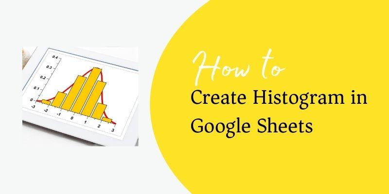
Do you want to learn how to make a histogram in Google sheets? If yes, then you can certainly do it by going through this post. Actually, here you are going to learn how you can manage or make histogram in Google sheets. But before learning the same, you first need to grab information about histogram. Knowing what exactly histogram is certainly an important thing to keep in mind.
You can use a histogram especially when you need to show specific distribution of data throughout different ranges or buckets. Here, you need to remember that the height of given each bar could represent the count of certain values in given each category or range.
Are you confused?
Let’s take for instance, if you want to show how long a customer might be on hold with customer service, you can use it.
How Can I Format My Data?
When it comes to learning how to manage a histogram in Google sheets, you first need to learn how you can format your data.
For this, you need to follow given below instructions.
- In the first given row, which is optional, you can enter a certain category name.
- Remember, entries in given first row would be shown as labels.
- Now come to first column. Here, you need to enter specific numeric data according to your requirements. Moreover, you may also include a category name that could be optional in first column.
- When it comes to using other columns that could also be optional, you need to enter desired numeric data. Here, you again also add a specific category name.
Can I Customize My Histogram Chart?
It’s surely the most asked question. If you are also dealing with the above asked question, you need to understand that you can certainly customize your histogram chart.
For this, you need to follow stated below guide on how to customize a histogram chart in Google sheets.
- On your Windows PC, you need to open a Google sheet, and then spreadsheet.
- Now, double-click on the chart that you would like to alter or change.
- By going through right corner, you will find Customize option. Click on it.
- Here, you will find an option called Chart Style. Click on it.
- By clicking on Chart Style, you can make change to chart looks.
- If you want to make change to histogram, you need to click on Histogram option on right. Here, you can change bucket size, display item dividers, or even outlier percentile.
- Now, come to chart and axis titles option. Here, you can format or edit given title text.
- If you want to change given bar colors, you need to choose option called Series.
- In case of learning how to change text and legend position, you need to click on Legend option.
- Whether you want to format or edit axis text or simply want to set it for maximum or minimum values, you need to click on option called Horizontal Axis.
- Vertical Axis option can help you formatting or editing axis text, log scale, or set maximum and minimum values.
- If you want to edit and add gridlines, you need to click on given Gridlines option.
Why Do You Want to Make a Histogram in Google Sheets?
Having gone through aforesaid guide, now you must have learnt how to make or manage a histogram in Google sheets. But you also need to know why you really want to make a histogram. Yes, you would always need to choose a task that can help you catering your specific requirements.
Thus, before making a final decision, you first need to evaluate your requirements of changing histogram in Google sheets.


No Comments